Did you like the article? Share it!
There are cases in which packaging can become a determining factor for the sale of a product. In very competitive sectors such as the food industry it is fundamental to pay particular attention to how the product is packaged not only in order to protect it for possible transport or to report essential information but above all because the packaging is the first element that captures the attention of the future buyer.
The honey sector is undoubtedly one of the most creative from this point of view. The creativity of designers is indulging itself more and more by creating new creative solutions and packaging for honey that can not only be observed, but also used for different purposes. Have you ever bought a honey attracted by its captivating packaging? It's time to introduce you to some of the best creative honey packagingof the past few years.
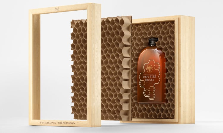
Supha Bee Farm Honey
Supha Bee Farm is one of the leading honey producers in Thailand. To stand out from the myriad of competitors on the market and at the same time show the quality of its product, the company has decided to create a completely innovative box.
In fact, it has been reproduces he structure of a real beehive which contains the honey bottle inside. The cardboard hive was inserted inside a wooden frame just like the one contained in a real beehive. Surely it is a creative box that becomes a real design object.
Creative agency: Prompt Design
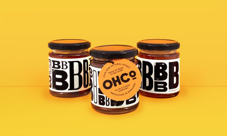
Ollie's Honey Company
The designer Ollie Langridge, after having spent years helping companies in the creation of brands and packaging, decided to become the customer himself by creating a new honey brand and dedicating himself to the design of the creative packaging for honey of his company " Ollie's Honey Company". Having fed up with the traditional choices, Ollie decided to forgo the classic honey label with drawn bees or hives. From this intent comes a line of unconventional and very creative honey labels. In fact, he decided to be inspired by the experience that all new beekeepers have, that is, being surrounded by a swarm of bees and the usual buzz that distinguishes it (here is the explanation of the B on the label).
This was joined by his great passion for typography. In fact, the designer chose to select a series of wooden typefaces in collaboration with a local printer and he used them to print some beautiful fonts that were scanned and reproduced on the label itself. His goal was to give a rustic, handmade and unique look to the product. For this reason, the designer has chosen to create a different label every year.
Designer: Ollie Langridge
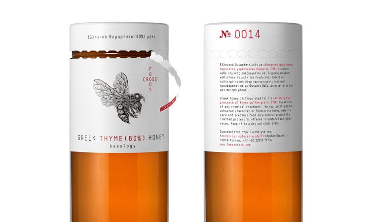
Foodscross Honey
For this Greek honey with a high concentration of thyme pollen granules, the Foodcross company has chosen a very interesting creative packaging. An ecological and at the same time limited edition package was designed for this very rare and natural product. Each package is in fact numbered and signed. The elongated jar covered is covered on the top with brand identity elements and relevant information, in a way that allows the customer to clearly see the specifications and package number even when the top is removed. The chromatic choice falls on colors such as black, white and red that recall a pharmaceutical / cosmetic language and give the packaging an elegant and unique appearance.
Creative agency: mousegraphics
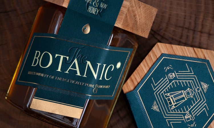
The Botanic
The Botanic is a natural raw honey that has been packaged in a very special jar. The hexagonal shape is surmounted by a handmade cap made entirely of lime wood, a plant from which part of the honey is collected. To further embellish this creative packaging for honey is undoubtedly the label that sees a multi-level debossing, copper foil details that stand out against the dark green background and a die-cut in a customized shape. The label and the seal are in fact united in a single solution.
Creative Trade Mark's ambition was to create The Botanic raw honey product labels and packaging that reflected the purity and natural integrity of the product.
Creative agency: Creative Trade Mark
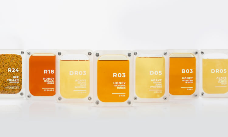
HoneyGreen+
Innovation by nature is an undoubtedly futuristic project that saw the HoneyGreen + company and the Valencian design studio CuldeSac Custom as protagonists.
The creative team of CuldeSac Custom has based its work on the design of the product packaging, born from the analysis of the relationship between the customer and honey and the way they interact. From this comes a real capsule that highlights the different shades of the various types of honey. It consists of two methacrylate blocks, internally sealed and closed with a visible screw that highlights the concept of hermetic closure. Each package is filled to 90% of its capacity, thus allowing the creation of an air bubble which, through the manipulation of the customer, allows to enhance the properties of honey such as density, color and transparency.
Creative agency: CuldeSac Custom
As you may have noticed from these 5 case studies of creative packaging for honey, the solutions are many. You can start from a simple creative reinterpretation of the label to the complete transformation of the jar into something science fiction. It all depends on the DNA of your brand and the designer's ability to create something creative starting from it. If you need help or have any questions please do not hesitate to contact us. The Oppaca Team will be happy to help you in the creation of a creative packaging for honey!
Related post
Learn more
Jul 01, 2020
May 27, 2022
May 25, 2022