Did you like the article? Share it!
In the agri-food sector, label plays a fundamental role in attracting new consumers. Food labels must certainly reflect the quality of the products and above all provide customers with essential information. But how can your products differentiate from your competitors? Let's see the story of Eat Dream company and its young founders, Andrea, Pietro and Francesco.
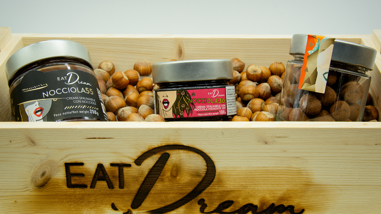
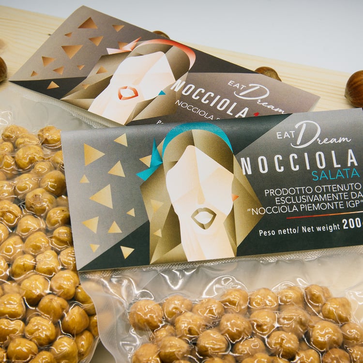
Eat Dream is a start-up born in 2018 from the ambitious dream of three young friends, who wanted to bring the experience of the "Tonda Gentile Igp" hazelnut from Alta Langa into everyone’s home. An experience that starts from the tradition of the hazelnut a high-quality raw product, and which is best expressed in four hazelnut cocoa spread 100% Hazelnut Spread (Hazelnut 30 and 30+, Hazelnut 55 and Hazelnut 40) and dry products such as hazelnuts in shell, roasted, salted and praline.
As we all know, the market for chocolate and hazelnut spreads - in Italy as well as in the rest of the world – is dominated by one famous leading brand, which today owns more than two thirds of the entire market.
On the wave of health trends and addressing to a conscious consumer who is looking for products with few quality ingredients and a traceable supply chain, these three young minds have decided to differentiate their products to propose different choices to the final customer.
On the wave of health trends and addressing to a conscious consumer who is looking for products with few quality ingredients and a traceable supply chain, these three young minds have decided to differentiate their products to propose different choices to the final customer.
The production flagships are the so-called "tresorelle", hazelnut cocoa spreads characterized by a different percentage of hazelnut. A selection of three Piedmont IGP hazelnut spreads: the 30% hazelnut, delicate with milk, the 55% hazelnut for dark chocolate lovers and the 40 hazelnut for white chocolate addicted.
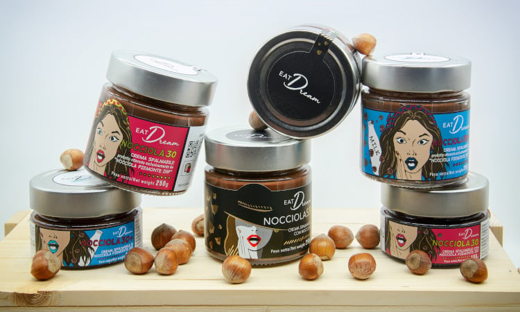
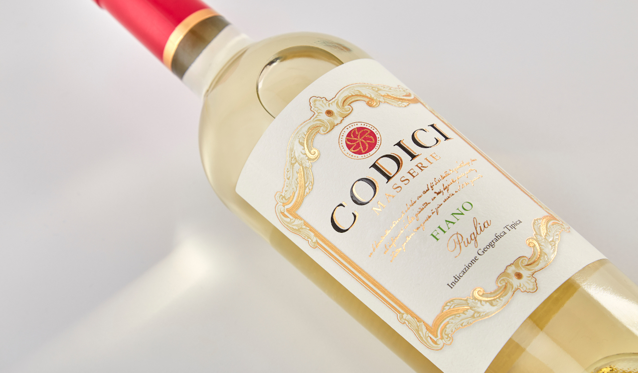
The food labels designed by the young designer Carolina Artuffo express the explosion and intensity of flavors that the consumer can experience while tasting the products.
This feeling is expressend by image of a surprised and ecstatic woman, who represents the common thread of the entire product line.
This feeling is expressend by image of a surprised and ecstatic woman, who represents the common thread of the entire product line.
The fresh and witty style inspired by Pop Art of these food labels fits perfectly whit the young age of the founders. Rather than opting for complex finishing, the designer decided to give maximum emphasis to full colours through the use of coated and metallic papers and highly opaque varnish.
This type of products is suitable for specialized sales channels, loved by customers who seek quality before price. These sales channels are generally dominated by organic products characterized by single-color, minimal, sometimes unappealing food labels. With this strategic and original choice, Eat Dream has been able to break the mold and get noticed among its competitors. Good job!
Would you like to print your food labels as well?
Check out the 10 steps to follow for the perfect label!
Follow EatDream on www.EatDream.iti
Related post
Learn more
Jul 24, 2020
May 25, 2022

May 24, 2022