Did you like the article? Share it!
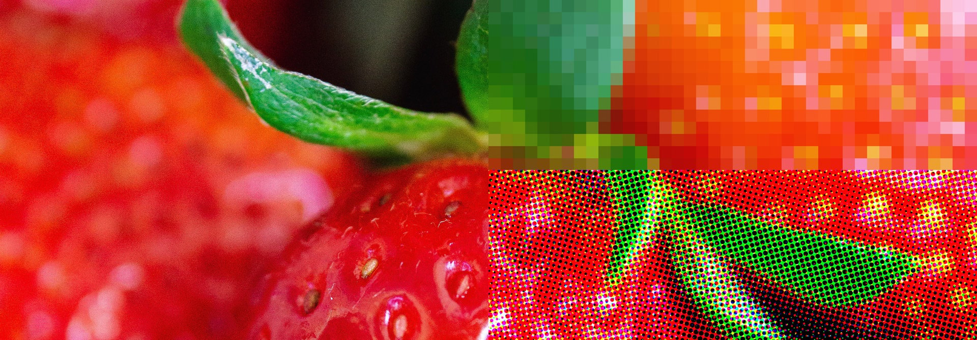
Color can be tricky sometimes. How many times did it happen to you that the printed color of your label wasn’t exactly what you thought about? Let’s see how using Pantone can solve this problem.
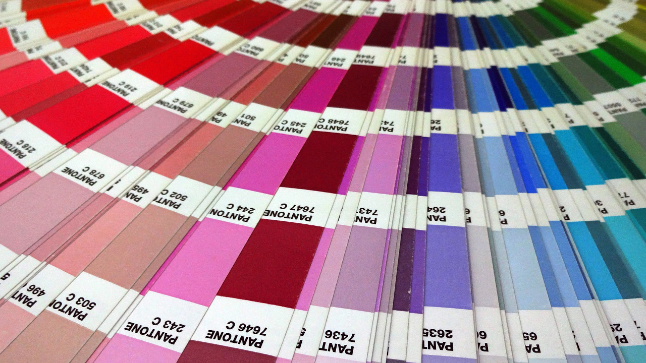
In 1963, Pantone revolutionized the printing industry with the colorful Pantone Matching System also known as PMS, an innovative tool allowing a conscious selection and reproduction of color anywhere in the world. Pantone’s color language supports all color industries; textiles, apparel, beauty, interiors, architectural and industrial design, encompassing over 10,000 color standards across multiple materials including printing, textiles, plastics, pigments, and coatings.
Pantone’s main mission is to provide a universal language of color that enables color decisions through every stage of the design and production workflow for brands and manufacturers. Pantone products and services help designers all around the world to define, communicate and control color from inspiration to realization. Pantone Standards feature digital and physical color specification and workflow tools.
The Pantone Color Matching System is largely a standardized color reproduction system. By standardizing the colors, different manufacturers and printers in different locations can all refer to the Pantone system to make sure colors match.
Pantone in the printing industry, why using it and how to manage it correctly.
Another standard color system used in the printing industry is the CMYK process. The CMYK process is a method of printing color by using four inks which are cyan, magenta, yellow, and black (to know more about it go check our article " What is CMYK? What is it used for (IN THE PRINTING INDUSTRY)").
A majority of the world's printed material is produced using the CMYK process, also a special subset of Pantone colors can be reproduced using CMYK (even Pantone has created a specific colorbook called Color Bridge Guide Set with the Pantone CMYK convertion). Unfortunately the CMYK gamut is not so wide to reproduce faithfully all the Pantone colors.
This is the reason why Pantone spot colors (color generated by an ink (pure or mixed) that is printed using a single run) are usually created with a mix of base pigments in a specified amount. Pantone colors are named with their allocated number (typically referred to as, for example, "PMS 130").
Unlikely, even if you choose a specific Pantone color with a specific number, the color you get in the end depends on the type of substrate you’re printing on. Deciding when to use coated or uncoated paper can make all the difference when printing a Pantone color.
A coated paper has a shiny gloss coating on the surface, and the ink sits atop the coating allowing for minimal ink absorption. On the contrary an uncoated paper has no surface coating permitting maximum ink absorption into the paper.
This main difference between these two types of substrates gives a different visual appearance to the Pantone color. The coated paper will make the color brighter, on the uncoated paper the colors will result darker.
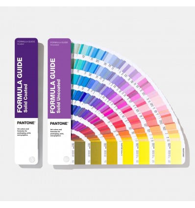
For this reason Pantone has introduced the Coated and Uncoated color guide called Formula Guide which are two portable, handheld fan decks printed on coated and uncoated paper with 2,161 spot colors. Each color is displayed with its own number and all the infos about ink formulation.
Now that you know more about Pantone and how to use it you can express yourself through colors.
But before you start creating your own design always remember to choose the substrate. This choice is really important because it will influence the final visual result of colors.
But before you start creating your own design always remember to choose the substrate. This choice is really important because it will influence the final visual result of colors.
If you want to buy the Coated and Uncoated color guides please check Pantone online store here or just take a look at their website on www.pantone.com.
If you have some questions about Pantone or you want just to know more about some other topics feel free to fill this form and a member of the Oppaca Staff will respond as soon as possible.
Related post
Learn more
May 27, 2022

May 15, 2020