Today in Italy there are about 1,000 beer brands, many of which appeared only in the last five or six years. That of craft beer is therefore a highly competitive market, where to emerge is not enough to guarantee a high quality level, but it is necessary to stand out from the crowd and propose something new.
The most immediate tool to achieve such a goal is the label: the image of the beer becomes the visiting card of the brewery and a fundamental component to attract the attention of the consumer. But the label plays a much deeper role: it is the means by which to convey information to the potential buyer and, in a broader sense, to educate it towards an informed choice.
Like the cover of a book, it is often the most important element in determining consumer choice and, in extreme cases, what determines the success or failure of a beer. What then are the characteristics to evaluate to create a valid label? The answer will be given to us by Andrea Turco, a blogger from the world of beer with his portal cronachedibirra.it that will help us design the perfect label for your craft beer bottle.
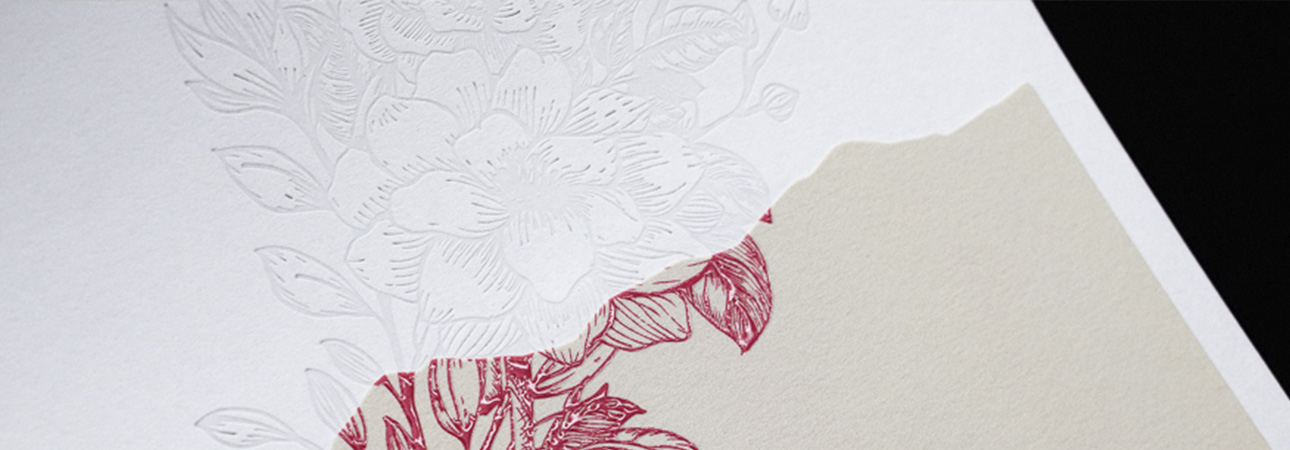
Clearly the first parameter concerns the visual impact of the label. First of all, a label must be pleasant to see, that is, to represent an illustration or a motive that is the result of a serious graphic study behind it. In this sense, particularly effective are the labels that follow the aesthetic trends of the moment, but without appearing too similar to those of other breweries. It is therefore necessary to negotiate a subtle game of balance, which, if well established, can bring excellent results.
But a label should not be simply "beautiful", but also visually effective. It must capture the eye of the potential consumer at first glance, being able to stand out among dozens of competitors. An illustration that looks wonderful on paper may not be effective on a bottle, because it is not very "impactful". Therefore we need strong traits, strong colors, written in the right size: a label must be recognizable in a few moments even from a distance.
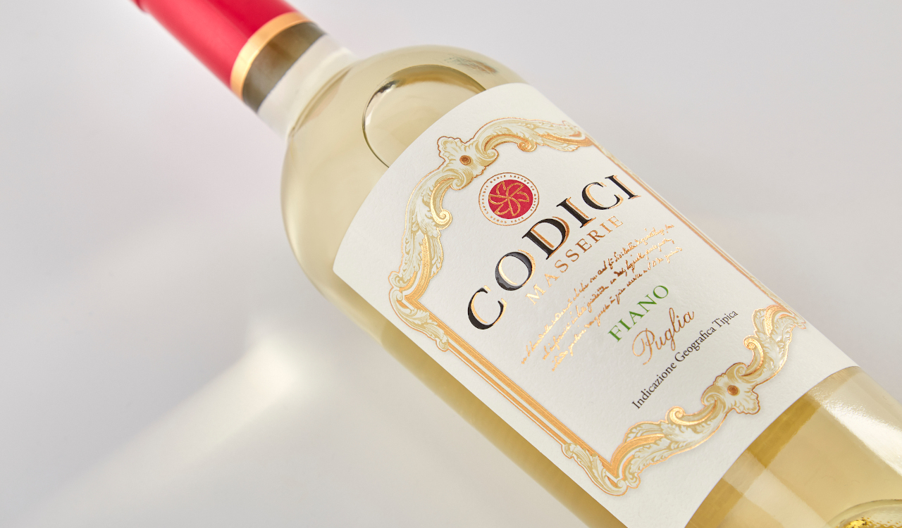
In addition to being nice to see, a label must have the ability to be immediately associated with the relevant brewery. The general criterion is that the company logo (or its name) is clearly present on the label, but at the same time incorporated in a manner consistent with the rest. There are exceptional cases in which an exception to this rule can be made, namely when the illustrations are so peculiar, memorable and effective that they do not require the presence of the brewery logo. It is a custom that has spread with the rise of minimalist graphics, but which for obvious reasons is very risky.
However, it is natural that placing a logo on the label is not enough to make the association with the relative company immediate. The general visual identity must be consistent for all products: in other words the different beers of a brewery must maintain a strong identification style in common with each other. At the same time, however, each label must have graphic characteristics that distinguish it from its "sisters". Also in this case, therefore, the key is in balance: it is necessary to find the right compromise between stylistic homogeneity and individual character.
The importance of the two parameters considered so far can be drastically reduced if the label is not clear for the final consumer. The potential buyer must immediately understand what kind of beer he has in his hands, without being forced to look for the most important information around the bottle, perhaps hidden among thousands of other writings.
The parameter we have considered here depends on various elements:
- Graphic clarity - There are labels with beautiful illustrations, made however in a style too chaotic for the functions they have to perform. In other cases, unclear fonts or stylistic virtuosities that compromise the general understanding are used.
- Clarity of information - In the main part of the label should be at least reported the name of the beer and the style or type of membership, as well as clearly the name or logo of the brewery. Some brewers make the mistake of inserting the typology of beer on the back label, jeopardizing the immediacy and effectiveness of the information.
- Semantic clarity - Information not only must appear clearly and in a visible position, but also make sense. The names of the beers should neither be too vague (eg "Bionda") nor too cryptic for the potential buyer. Just as it is useless to invent strange types composed of acronyms and dozens of intertwined words: they end up only confusing ideas to the consumer.
The secondary part of the label (generally the back label) allows to convey additional details with respect to those that must be received at the first impact. And here the richness of information is important, understood both in quantitative and qualitative terms. In addition to the mandatory elements (ingredients, alcohol volume, expiration, net content, etc.), the brewery must pay attention to provide additional content that can guide the consumer in the purchase choice. Some can be reported in descriptive form, others in graphical form. Here are some examples:
- Description of the beer.
- Organoleptic characteristics (color, prevailing taste, etc.).
- History of the brewery.
- Recommended glass.
- Possible food pairings.
- Packing date.
- Conservation advice.
However, it is advisable to maintain a certain degree of synthesis: filling the label with dozens of different information, perhaps compressed in very long and redundant texts, certainly has counterproductive effects.
Designing a valid and effective label is a considerable but very fascinating challenge. In a few square centimeters it is necessary to create a design of great visual impact and capable of immediately conveying the image of the company. But at the same time it is necessary to insert so many different information and do it clearly for the final consumer. It is an ambitious and difficult job, but if well done it can make a decisive contribution to decree the success of a brewery on the market.
Want to learn more about the Oppaca label printing service? Contact us!