Did you like the article? Share it!
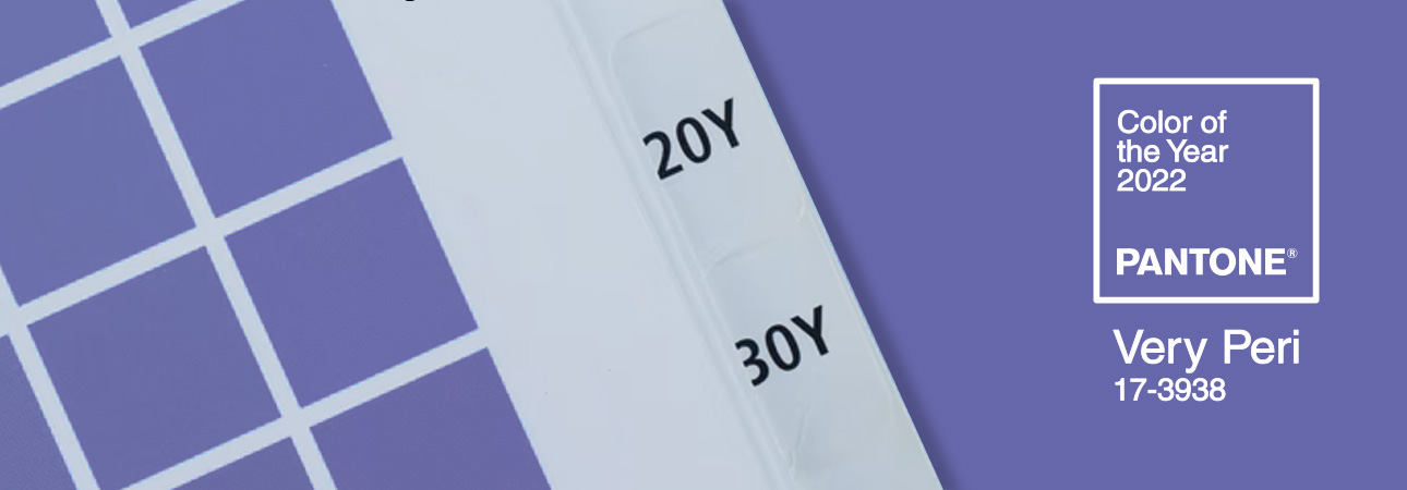
The Color of the Year Pantone 2022 is a new entry in Pantone’s home! This year's chosen one was PANTONE 17-3938 Very Peri, a periwinkle blue contaminated by a purple-red undertone, with a lively and joyful attitude that encourages creativity and knows how to dare.
Pantone's selection of the "Color of the Year" has become one of the most anticipated moments of the creative sector. Designers, photographers, architects and enthusiasts generally look forward to the announcement because the chosen shade influences the design and marketing trends for the whole following year. Since 2000, the Pantone Color Institute has selected a particular colour as the “Color of the Year” every December. Photographers, graphic designers, advertisers and artists come together to decree the reference colour for the following year and which at the same time reflects the current world.
The chosen colour reflects, in fact, the historical moment we are experiencing and tries to express what people need. PANTONE 17-3938 Very Peri has the task of inspiring energy and creativity in these difficult times, showing carefree confidence and bold curiosity.
Have we intrigued you?
Well, let's find out the reason for choosing Very Peri as Color of the Year Pantone 2022!
“Interpreting the spirit of the time to transform it into colour”
For the first time in the history of Color Of The Year Pantone 2022 was created from scratch. It is not an existing shade associated with the new year, as has happened until now, but a novelty explicitly designed for 2022. The choice was made because of the particular historical period: Pantone of the year also needed an innovative boost in an era of continuous transformations.
“ By creating a new colour for the first time in the history of our Pantone Color of the Year educational colour program, we reflect the global innovation and transformation taking place. Society continues to recognize colour as a basic form of communication and a way of expressing, influencing and creating ideas and emotions, of involvement and connection. The complexity of this new red-purple-infused blue hue highlights the boundless possibilities.”- explained Laurie Pressman, Vice President of the Pantone Color Institute.
PANTONE 17-3938 Very Peri tells of a world slowly emerging from a difficult period of isolation, bringing a new way of living. We can define the chromatic transposition of how the trends of the virtual world are affecting the real world. Technology and reality are increasingly mixed, thanks to Digital Design, which allows us to extend the limits of reality, opening the doors to a virtual or metaverse world, in which new possibilities of colour can be explored.
Discover colour palettes with PANTONE 17-3938 Very Peri
PANTONE 17-3938, code name: Very Peri
Leatrice Eiseman, executive director of the Pantone Color Institute, explains how the choice of Very Peri came about: "[...] The blue family was the starting point because it is known to be a colour, which corresponds to familiarity and comfort. Blue includes the 'safety' factor. However, it was also necessary to convey a sense of freshness, vitality, a push towards the future, which also referred to the digitized world. Here the purple-red undertone came into play ". "It was necessary to create a new colour to reflect the innovation and the global transformation taking place - specified Eiseman - because the world needs an attitude that is once again lively and joyful".
Blue is the colour that expresses a sense of security, which is why the starting colour was, more precisely, the 'periwinkle blue', which refers to the flower of the same name, containing shades of light blue-violet tending to grey. Chromotherapy is the anti-stress colour par excellence, together with blue and turquoise. On the other hand, the touch of vitality was given by the purple-red undertone, which must serve as a push towards the future. From this combination was born "Very Peri" 17-3938.
Pantone Color Institute: the choice of colour
Pantone is a US company born as typography in the late 1950s in New Jersey. Thanks to the chemical skills of one of the employees, Lawrence Herbert, the company was able to standardize colours, introducing the 'Pantone Matching System (PMS)' in 1963. It is a colour reproduction system, a chromatic language that everyone can use, which has made it possible to catalogue colour uniformly in every country in the world.
But how does the choice of Color of the Year come about? Where do the combinations come from, and how does a historical moment translate into colour? The task is entrusted to the Pantone Color Institute, Pantone's research centre. The choice of the colour of the year is the result of careful analysis. Influences and trends from all over the world are examined. Studying these needs is a team of professionals, designers, consultants, architects, creatives and trend analysts who study cultural and socio-economic changes.
Are you curious to find out what the Pantone Color of the Year 2021 was?
Read the article here
Using the PANTONE 17-3938 Very Peri
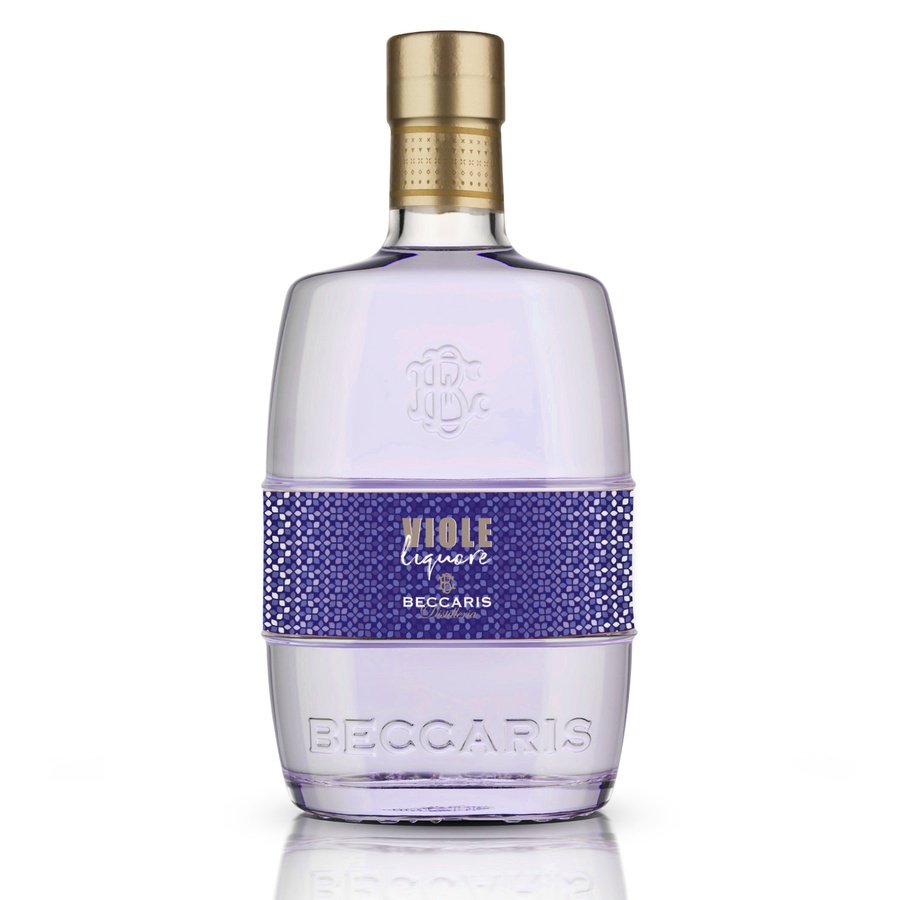
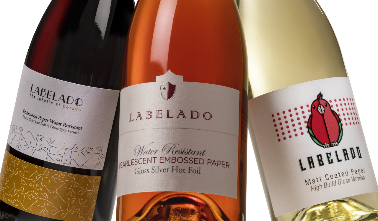
The colour of 2022 is a bold colour, which can be used to create labels, packaging and graphic designs in line with the latest trends. Use it individually or combined with other colours. The result will undoubtedly be very effective if you find the right combination! It can be used in some details to give a touch of vitality and elegance to a label with a white background or combine it with unique processes and finishes, such as a silver or copper foil, rather than a transparent, glossy varnish that enhances the colour even more.
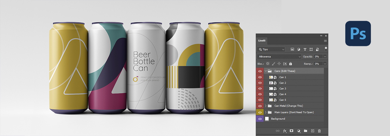
Indeed a particular nuance, which is also well suited to products from more traditional sectors such as those of Wine, Spirits and, why not, Beer, which is looking for something innovative. An excellent idea for cosmetics is to get away from the usual shades of pink so used in this kind of product.
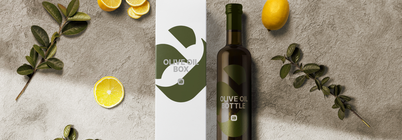
With Color of the Year Pantone 2022 the creative possibilities are undoubtedly many. You have to find the one that best suits your brand! Do you want to test this Pantone on your adhesive labels or packaging? Request a print proof and send us your graphic file. The Labelado Team will be happy to help you. You can find the contact form below.
Related post
Learn more
May 26, 2022
Jul 01, 2020