
Did you like the article? Share it!

Designing a label is a very complex process made up of countless choices to make. One of the most important but also difficult is certainly the choice of the appropriate colours for the label. Let's see together what are the modalities for their choice.
Primary, secondary or tertiary colours?
First, we need to introduce what are the fundamental basics of colour in order to get started. Do you remember hearing about primary, secondary and tertiary colours, perhaps during drawing classes, graphics design courses, etc.? Let's do a quick recap together.
- Primary colours are those that you cannot create by combining two or more colours together.
- Secondary colours are a combination two of the three primary colours listed above.
- Tertiary colours are created when mixing a primary colour with a secondary color.
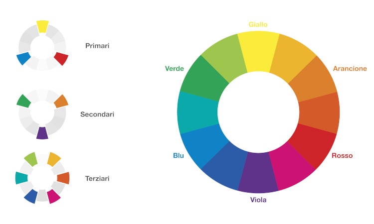
The color wheel
When choosing a colour, you cannot rely on the limited choice provided by primary, secondary and tertiary colors. In fact, when choosing the colour of a label, other factors come into play that make it possible to create lighter, darker colors with different shades.
The mix of these factors makes it possible to obtain countless different colours from each other. Let's see in detail what these factors are:
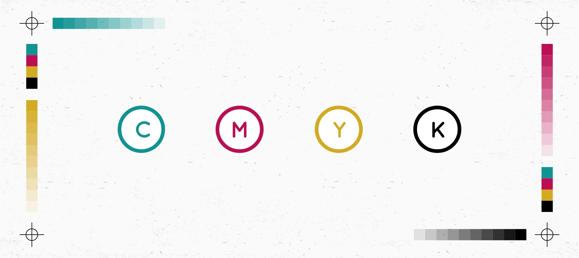
Colour or hue
Hue is pretty much also what we mean when we say the word "colour". All primary and secondary colors, for example, are "hues".
Brightness
Brightness distinguishes between darker and lighter colour tones.
Saturation
When the saturation of a chromatic tone decreases, the latter is less bright.
How to choose a colour scheme
1. Start with just one colour
2. Consider the chromatic context of what surrounds the label
3. Identify complementary colours
4. Focus on monochromatic colours in the same hue
5. Think beyond the presets
Start with just one colour
Our advice is not to insert too many variables in the first design phase of a label. Start with a single colour that will be the backbone of the label in terms of colour and then add small touches of other colours (if the first colour is not enough) in order to create a complete and effective design.
Consider the chromatic context
The same colour is perceived differently depending on the context in which it is inserted. For example, the same ruby red if placed on a white background is perceived as a clean and saturated red while if placed on a dark background such as black it is perceived in a darker way. This really depends on the so-called chromatic context. The chromatic context in fact refers to the way in which we perceive colours while they are in contrast with another colour.
Identify complementary colours
Still not satisfied with the colours for your label?
You may need to introduce some complementary colours. Complementary colours are nothing more than colours placed directly opposite each other on the colour wheel and the resulting hues of those colours.
The complementary colour scheme offers the maximum amount of colour contrast. In order not to get an exaggerated result, harlequin style to be clear, it is preferable to use one colour predominantly and use the second complementary colour on some details in the design.
Focus on monochromatic colors in the same shade
If, on the other hand, you are more in line with a monochromatic choice, you can select shades of the same shade. Even if it lacks colour contrast, the label will look very clean and harmonious.
Think beyond the presets
Many graphic software automatically provide the most appropriate colour combinations. Don't let yourself be influenced, however, but develop your colour sensitivity little by little. Practice will surely help you develop your colour vision.
If you manage to identify colour combinations for your interesting labels, don't miss them. Save them to your chromatic database. If you do not use in the project you are carrying out you can ude it for the future.
Suggested tools
Now that you have learned some of the basics that will help you choose the appropriate colours for your labels, we can show you some very useful tools to use in the colour search phase.
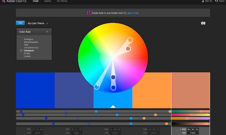
Adobe Color
It is the tool for choosing colours par excellence, whether you are designing a website, a label or a box.
Adobe Color (formerly known as Adobe Kuler) is a free online tool that allows you to quickly and easily create colour schemes. Once you have chosen the colours you can view the CMYK or LAB coordinates to see the correspondence in print of the chosen colour. Analogous colours are automatically associated with each colour (same colour with different shades) and any other premade colour combinations (complementary colours, monochromatic, etc.). If you also have an Adobe account, you have the opportunity to save each colour scheme and access it from all Adobe software linked to that account. Interesting right?
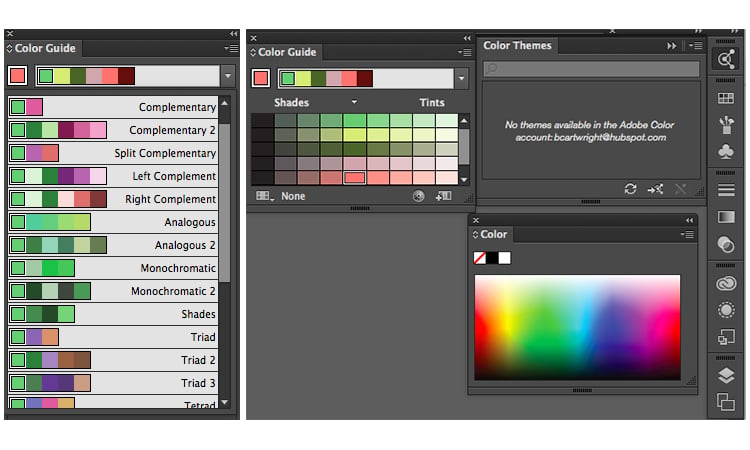
Illustrator Color Guide
Adobe Illustrator has an important function for selecting colors, namely the Color Guide.
In fact, by defining a base colour from which to start, be it CMYK or Pantone, the system automatically proposes a 5-colour scheme in which the same hue is proposed with This will also give you a range of shades for each colour in the scheme.
If you change the main colour, the colour guide will change the corresponding colours in that scheme. In addition, a series of preset modes are available such as complementary colours, analogues, monochrome etc.
Once you have created the colour scheme you want, you can save the scheme in the "Colour Themes" module which you can use in your project or in the future.
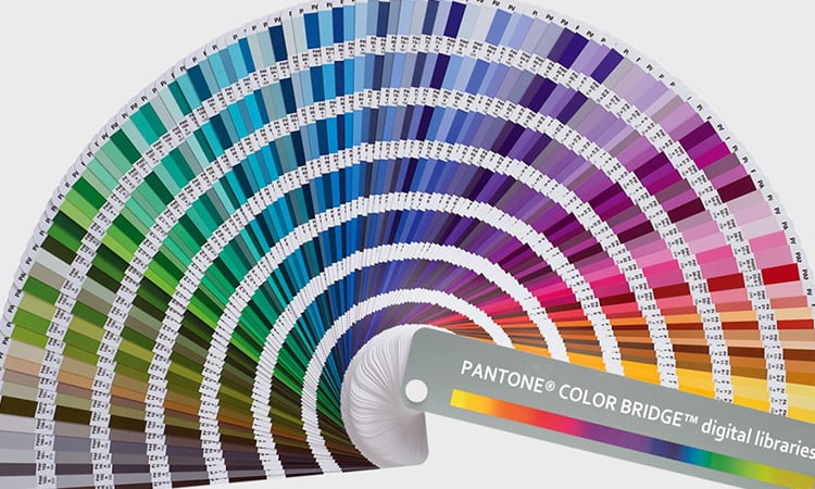
PANTONE
If you are using a Pantone Coated or Uncoated swatch and you are interested in finding shades of the same colour choose the colour you like among the various pages and on the same page you will find the other shades of the same colour.
Understanding colour means first of all knowing its theory. I know there is a lot to know but it is inevitable in order to choose the most appropriate colours for your labels. If you want to know more or want some advice write us and the Oppaca team will be happy to make your day more colorful!
Related post
Learn more

May 25, 2022

May 25, 2022