
Did you like the article? Share it!
We have already seen together all the information neeeded to correctly label a cosmetic product... Now we just have to think about creativity! Choose the perfect colours and paper for our label, that make our product stand out on the shelves and be consistent with the communication strategy chosen.
The cosmetic market is more and more competitive and fragmented: as a matter of fact, over the last lot of small and medium-sized brands are born and started to sustain important revolutions in this sector. On one hand, lot of brands take inspiration from the concept of sustainability, with natural, eco-friendly and cruelty-free products. On the other hand, lot of companies are following the last trends with high-end, ultra-performing products.
How to choose the best label paper
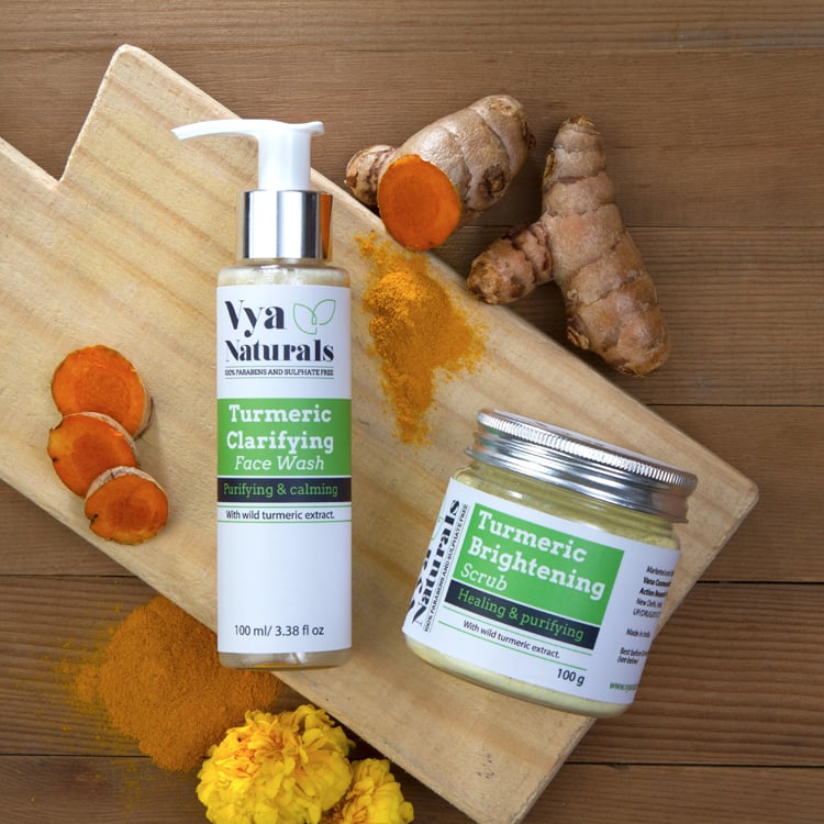
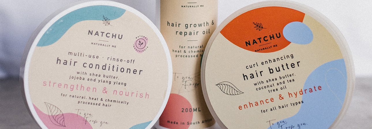
As seen before, cosmetic labels must be consistent with the brand strategy and reflect the characteristics that have to been communicated to customers. For a product characterized by eco-sustainability and natural ingredient, you can choose among a wide variety of water-resistant natural paper: from the felt-marked to embossed or cotton paper, they tactilly convey an idea of simplicity and respect for the environment.
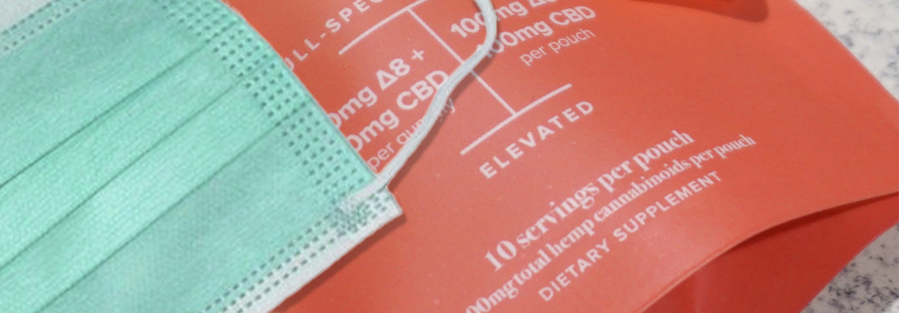
On the contrary, if you are looking for cosmetic labels for a product that fits into a market charcaterized by research and high-tech, you can choose unusual papers evoking premiumness and modernity. The most basic choice may be a glossy or matte water-resistant coated paper, but it is possible to choose among different options like the metallic silver paper or the transparent polypropylene for a no-label look.
Black and white or colourful sticker labels?
When choosing the colour for cosmetic labels, it is necessary to take into consideration three main aspects:
• Choose a colour palette in line with brand personality
• Colour must attract potential consumer’s
• It is necessary to stand out from competition
In a highly competitive market like cosmetics it is necessary to pay particular attention to this last point, sometimes underestimated.
• Choose a colour palette in line with brand personality
• Colour must attract potential consumer’s
• It is necessary to stand out from competition
In a highly competitive market like cosmetics it is necessary to pay particular attention to this last point, sometimes underestimated.
If the cornerstones of your brand are sustainability and respect for raw materials, green is a colour evoking health and nature and may be taken into consideration even if it is indeed overrated. Choice may be then fall on light, pastel colours that evokes delicateness and – at the same time – are different if compared to competition.
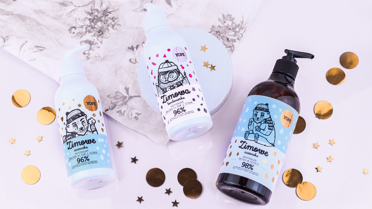
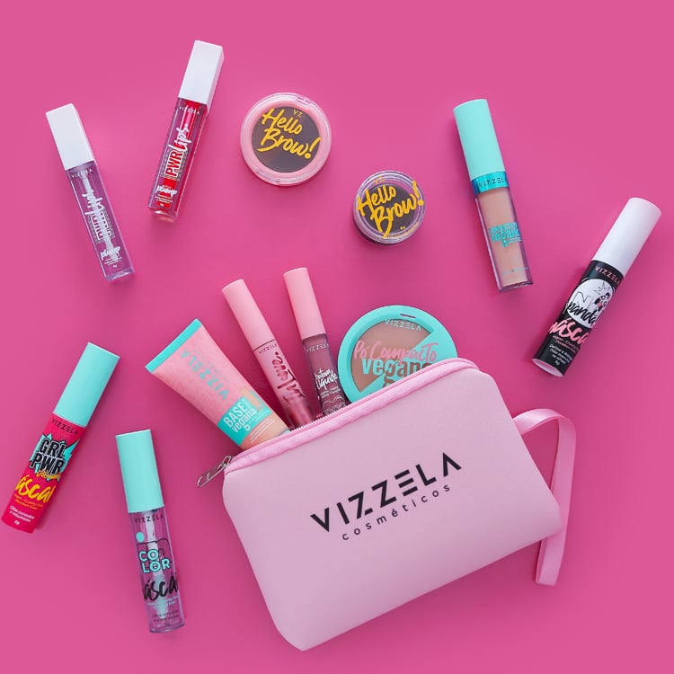
For a young, modern product you can opt for colourful sticker labels with bold shades: pink, yellow, turquoise… On the other hand, you can decide to create a cosmetic labels under the sign of simplicity and elegance and opt for a black and white to which eventually add silver or copper finishings.
Would you like to evaluate the chromatic outcome and the quality of the paper chosen? Require now a Print sample!
Related post
Learn more

May 25, 2022

May 27, 2022
May 26, 2022