
Did you like the article? Share it!
"If I'm not satisfied by the final result, that means I haven't done a good job." With these words we can feel the passion that Carolina – young designer of Labelado - puts in every project she deals with. Here she’s telling us how some interesting bottle labels were born…
Carolina Artuffo is the young designer of the Labelado team, the creative mind of the team. For years, she has handled new projects always giving importance to the technical side of a label. She defines herself a product stylist. After all, dressing a bottle or jar is her job. We had the chance to have a chat with her about "La Botticella", a very interesting project for which she created a new product packaging the new bottle labels.
1. Describe "La Botticella" project. Tell us a little about the company you worked for and the product (s) you dressed.
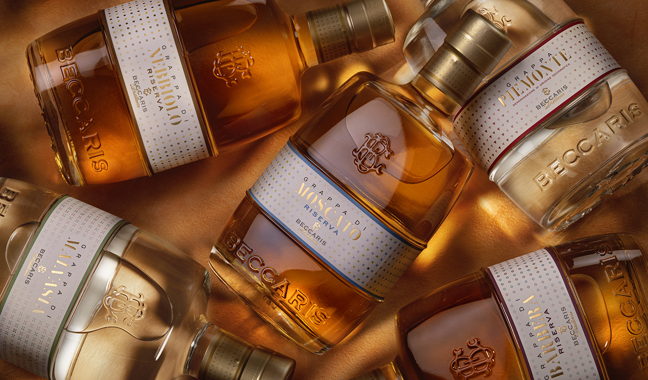
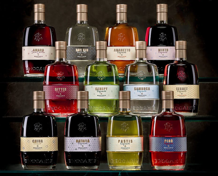
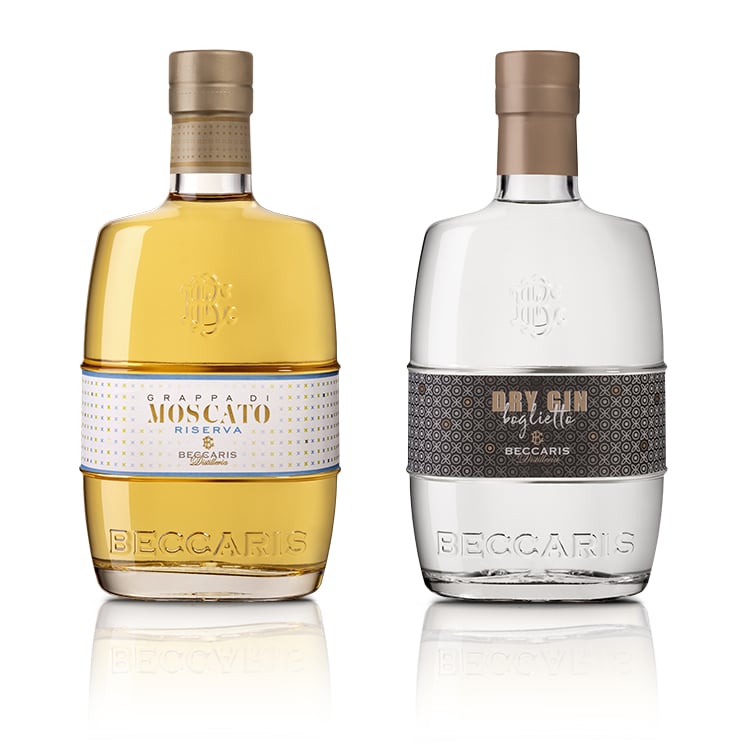
One of the projects I loved the most is "La Botticella" created for the Beccaris Distillery, a really historic distillery (1951). The new generation wanted to resume the company's history with a modern touch. For this reason, "La Botticella" was born, the iconic bottle of the company that has been redesigned, modernized and made of transparent glass to see the product inside. The original bottle has always been very dark and did not give enough prominence to the product. I was the "stylist" of this project. My goal was to dress the bottle in every aspect, from the capsule to the bottle labels. We started with the grappa line, the high-quality products, and then moved to a more complex mission: creating a line of liqueurs and spirits made up of 12 different products, from bitter to gin. It was an exciting job but at the same time very complicated.
2. Describe the creative process. How did you get to the final label? What led you to make the stylistic choices that we find on the label.
For this project, we designed three different bottle labels, from the classic style to the most modern. The option of using some symbols for each product and creating a pattern from them was immediately appreciated by the customer. Then we choose two colours for each product. In some labels the colours were contrasting, in others we used different tones of the same colour, from bright to pastel colours.
Obviously, the colour choice was dictated by the type of product. As we defined this main concept, we decided to take inspiration from different "moods" of the final customer. The most prestigious spirits are characterized by pastel shades, embossed paper, hot-foil details and a minimal pattern which reflects the classic and refined mood of the spirit lovers. On the contrary, the liqueurs and bitters have a stronger design typical of Milanese cocktail bars, thanks to more complex patterns, coated paper, intense colours and metallic gold details.
3. Describe the customer's requests. From the initial brief to the last word of the customer, what were their requests? And what were their goals instead?
When we were talking about the new packaging and the new bottle labels, the client's first words have been: “We must give a new look to this product line, we need to enhance it but without ruining the story behind it. Now it's all your job." There are the most beautiful words a customer can say. Of course, my main goal is always to satisfy the customer and being satisfied by the project. If I'm not satisfied by the final result, that means I haven't done a good job.
Related post
Learn more
May 27, 2022
May 26, 2022
May 27, 2022