
Did you like the article? Share it!
If you are a wine producer or graphic designer looking for inspiration, this is the place. Wine labels remain one of the most printed items by our company; they are also among the most complex and demanding labels that exist.
In this article you will find several inspiration points to refer to in order to design your own wine label!
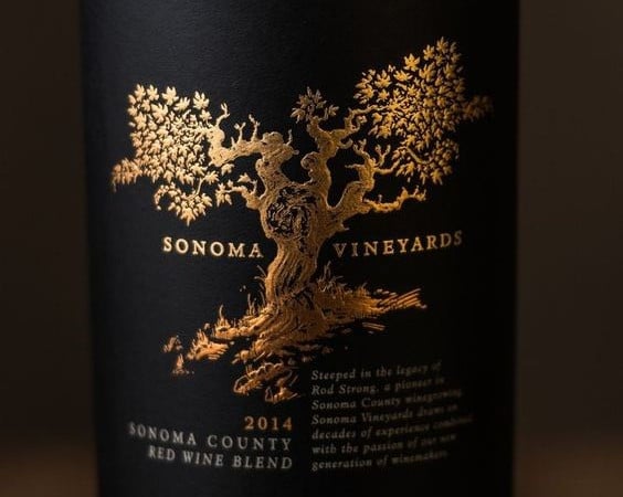
1. Sonoma Vineyards
Wine is the drink of luxury and tradition. Elements such as black and gold or hints of nature are always welcome. The Sonoma Vineyards label presents precisely these elements ... all together!
The label is printed on black paper such as Tintoretto Black Pepper or Avery New Black, with white ink (possibly silk-screen) and hot laminated with a decidedly warm gold foil, an almost ducal gold.
The tree and the words Sonoma Vineyards are accentuated by the presence of an embossing that creates three-dimensionality in the label, guaranteeing both plays of light and tactile effects for the customer who will touch it with his hand.
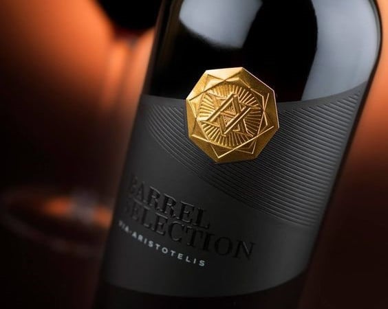
2. Via Aristotelis
This wine label inspiration is definitely impactful. The Barrel Selection of Via Aristotelis also features a black paste paper, with few elements with a very high added value. The element that stands out is the hot gold seal at the top, which was made with a foil and relief at the same time, obtainable with a brass punch with male-female relief.
The central lines were probably made in debossing, i.e. by pressing on the paper with a cold punch to create the grooves, this effect can be accentuated by a transparent hot foil to give it a slight degree of shine.
Via Aristotelis was printed in opaque white and Barrel Selection was emphasized by a glossy and thickened Braille screen printing.
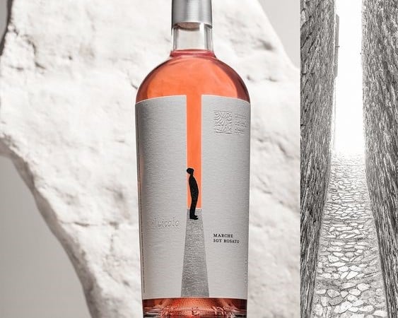
3. Il Vicolo
This label is a very interesting concept. As you can see from the image, the label represents a man with his gaze turned to the upper part of the typical Italian alleys, this one in particular is an alley that actually exists in the Marche which is considered the narrowest alley in the world.
The label is simple but has different complexities in terms of printing. The label is printed on a very porous paper such as Cotton White by Fasson Avery / Cotton White by Fedrigoni-Ritrama. The central elements that create the empty space between the two walls of the alley have been removed.
The road has been printed in silver foil with small micro-engravings that correspond to the cobbles of the passage.
"Il Vicolo" and the logo at the top right were printed in debossing, that is, using a punch for the hot foil that was applied cold (or at a very low temperature of 35-40 degrees centigrade to soften the paper support) .
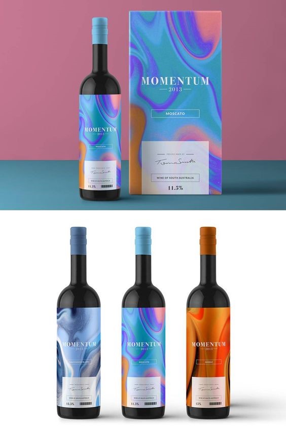
4. Momentum Wine
But does wine packaging have to be traditional? Apparently not! The Momentum line labels go against the rule of tradition, seeking a beautiful artistic and colorful image in the simplicity of a four-color print on uncoated paper.
These types of jobs give the best results when UV offset or digitally printed with HP INDIGO technology, which allows to obtain vivid and brilliant colors, even on natural and porous papers. Note the capsule combined with the shade of the single bottle, a simple box that shows the same texture as the wine label, and that's it.
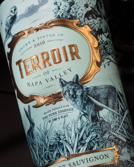
5. Terroir Napa Valley
This wine label inspiration seeks retro style by thread and by sign. An eye-catching landscape illustration printed on natural felt marked paper could be a Cotton Touch.
The hot foil has a warm hue such as Kurz's MTS 495. The details in the foil frame were not micro-engraved, to do a nice job they were overprinted with an offset or flexo color. To complete the whole a dry relief on the Terroir writing.
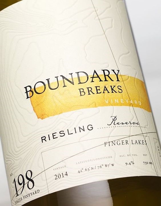
6. Boundary Breaks Wine
If there is an important detail to remember when designing a wine label, it is to leave room for paper; Boundary Breaks Vineyard is a label that features just this detail, and more.
The felt-marked natural paper is marked, creating topological areas, by a debossing that presses on the entire label. The simplicity of the colors (a black and a touch of yellow) creates calm and cleanliness.
The thickened serigraphy in register of the word Boundary Breaks crowns the whole and further embellishes the label.
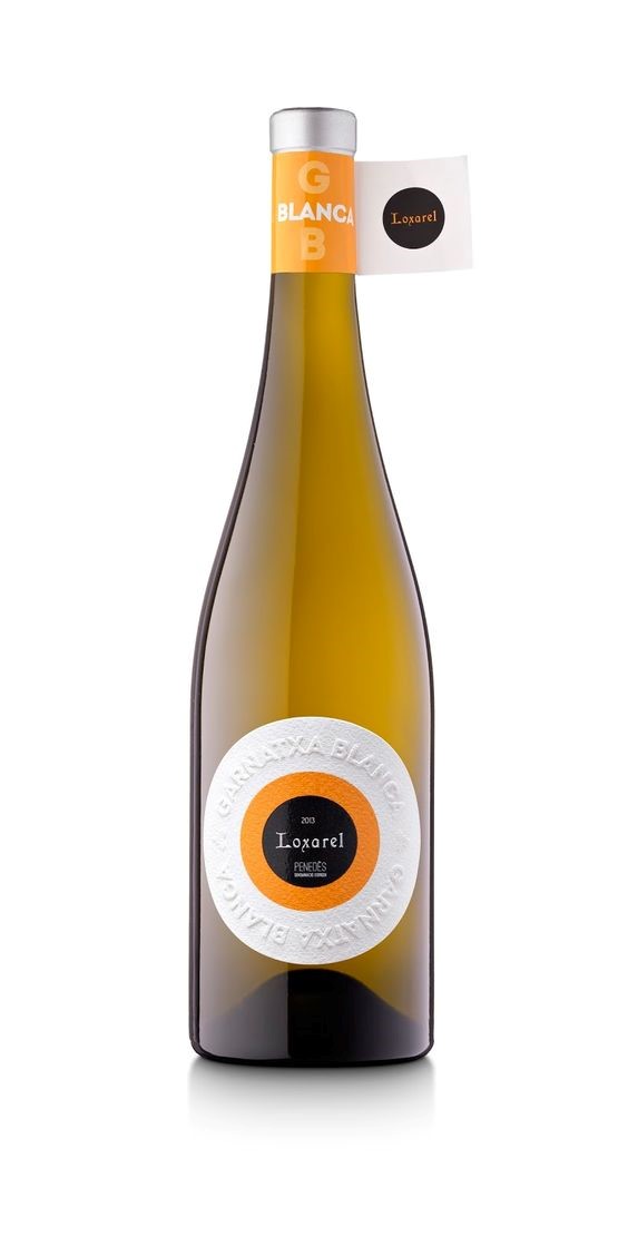
7. Loxarel Garnatxa Blanca
This label was printed on a textured paper that features the texture of the orange peel. Pantone Orange stands out in the center of the label, with a polished black in screen flat printing.
But the most important detail of this label is the majestic embossing that names the Garnatxa Blanca wine.
I hope that these wine label inspirations can inspire you in creating your own wine brand or in modernizing it. The world of wine is full of these and other interesting examples of art on the bottle!
Related post
Learn more
Aug 26, 2022
May 25, 2022
May 24, 2022
Feb 12, 2021