
Did you like the article? Share it!
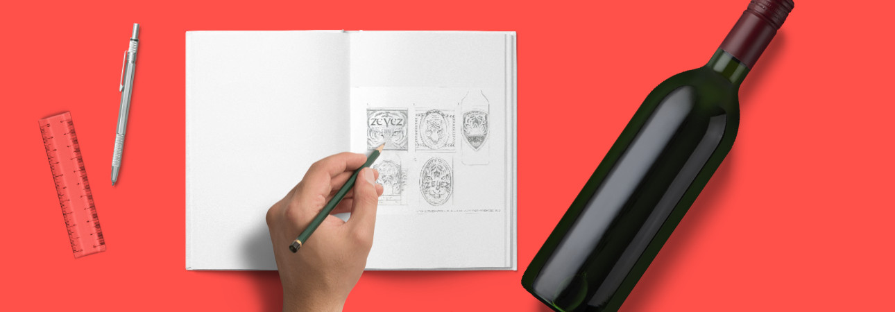
Creating a successful wine label design is an exciting challenge: you must have a great passion and creativity but at the same time you must be able to work in team with the customer to achieve exceptional results.
Mariana Ruggeri, a designer originally from Mendoza (Argentina), has combined her passion for good food and wine and her creativity to build her job. We chatted with her to find out how she developed her creative approach. If you want to take a look at her portfolio click here.
1. Describe your job. What do you do, what are your peculiarities and your creative approach on a new project.
A designer always wants his work to stand out and be creative. We know that creativity is what makes a product or service memorable. Either for a sale or simply to send a message. The interesting thing is to always work in a team with the customer and create a message together with him, as a designer is a tool for modeling a concept, (but not a mouse driver).
2. Let’s talk about labels. What does it represent for you? What led you to specialize in this sector?
My passion for good food and wine led me to devote myself to the design of Food and Beverage Packaging. Since I was in Argentina I started to evolve my profession in this field and when I arrived in Italy I confirmed this passion.
I come from Mendoza (Argentina), one of the new capitals of wine, which has had to innovate in the design of its labels to find a place on the market, to be able to face the great wine producers in the world. For me, creating a label is telling a story, sharing an experience, transporting us to a new world that we have invented. " The first bottle is sold by the designer, the second by the winemaker" the designers are responsible for attracting the consumer and we must be persuasive enough to create a wine label design with a link with the product ... in a second phase the product must meet expectations.
I come from Mendoza (Argentina), one of the new capitals of wine, which has had to innovate in the design of its labels to find a place on the market, to be able to face the great wine producers in the world. For me, creating a label is telling a story, sharing an experience, transporting us to a new world that we have invented. " The first bottle is sold by the designer, the second by the winemaker" the designers are responsible for attracting the consumer and we must be persuasive enough to create a wine label design with a link with the product ... in a second phase the product must meet expectations.
3. Describe a project that represents you. Tell us a little about the company you worked for and the product (s) you dressed.
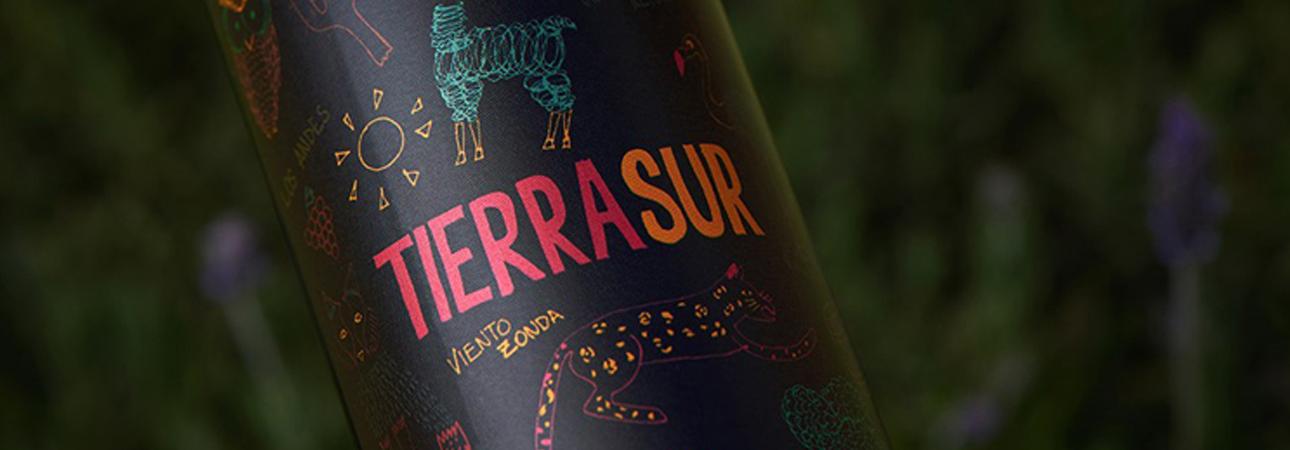
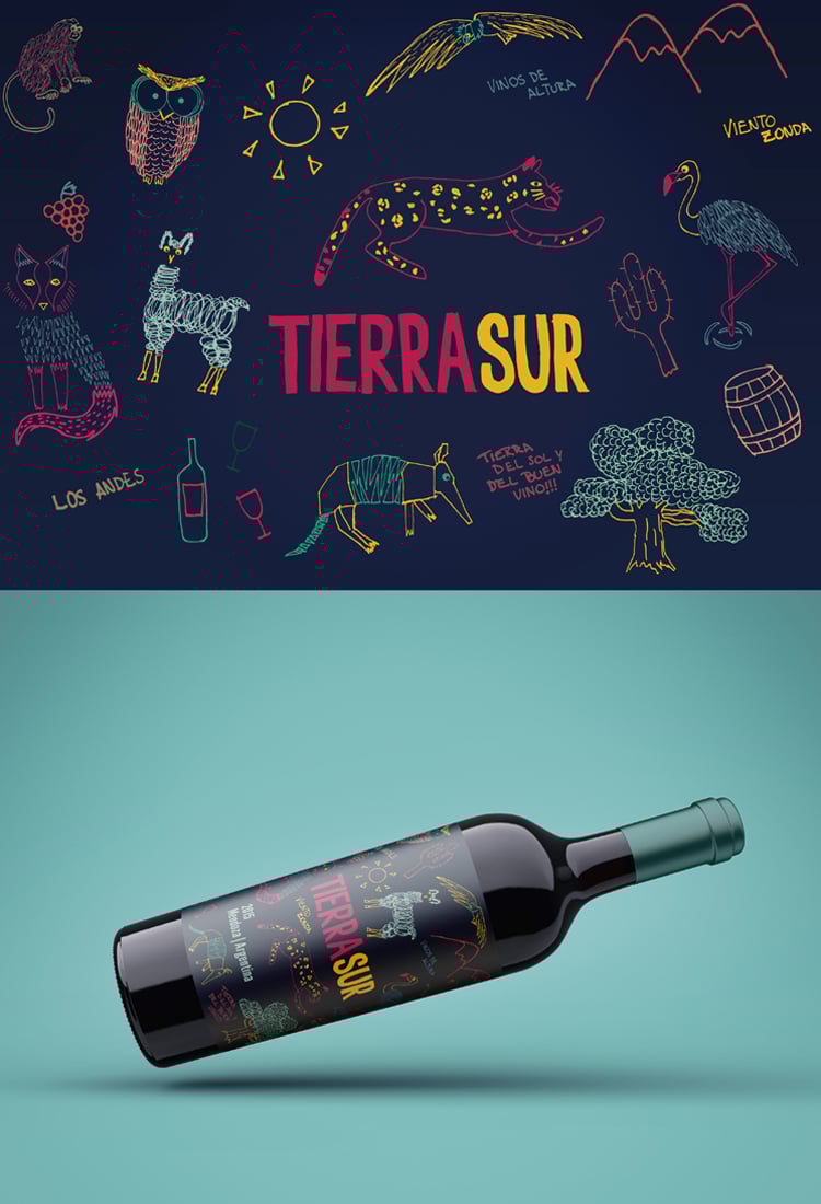
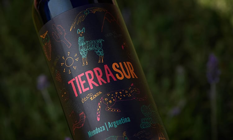
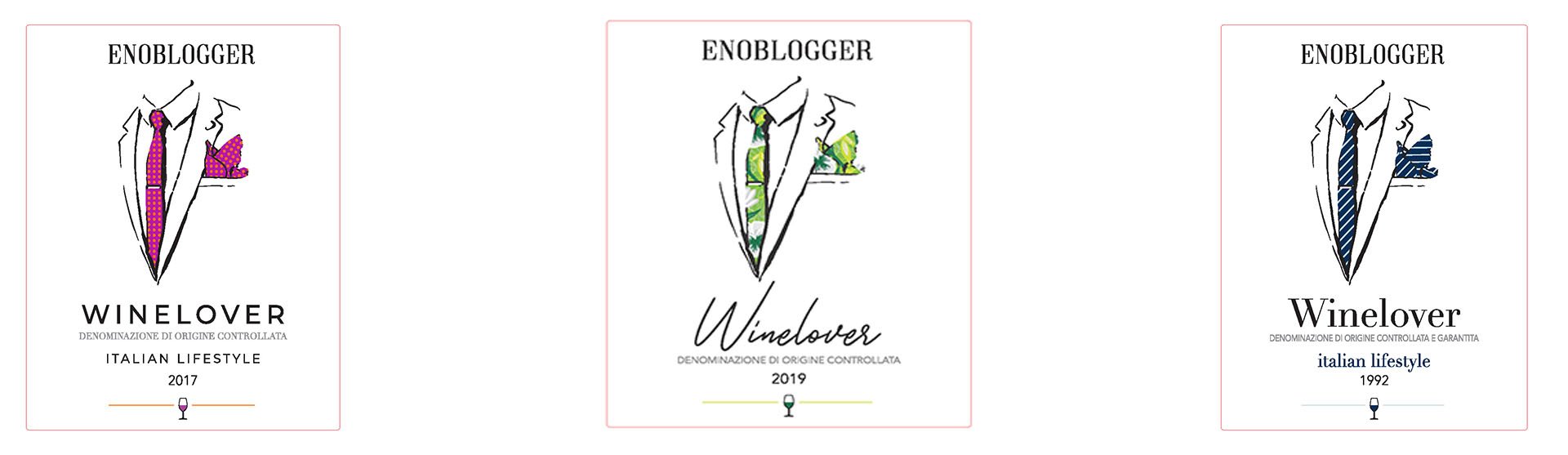
Tierra Sur, (one of my favorites) was a quite different project than what you are used to working on. It was the first time I entered the United States market, so I was very involved in the whole development process. It is a project by Valle Austral State, so we wanted to emphasize the idea of " southern hemisphere", although it was a new brand, we did not want to detach ourselves from the general concept of the winery.
Value proposition of the brand identity: the goal was to show a wine from SOUTH AMERICA (from Argentina), that's why the idea of creating illustrations of flora and fauna and its colorful landscape character.
Product positioning: it is a young, entry level wine for a young consumer (or young mentality) who is always open to experimenting with new flavors, a traveller or an explorer of the world, who sees Argentina as an exotic destination.
Dimensions: 100 x 120 mm
Printing: flexography
Character: handmade
Substrate: Orion Frozen
Finishing: We had a limited budget, so it was decided to bet on paper and not make expensive finishings.
The illustrations that ended up on the labels were the same that I did in front of the client during the meeting while we were doing Brainstorming. In the end they turned out to be fresh, relaxed, what gave a particular touch to this wine label design was the choice of the color that creates strong contrasts and the type of paper, from which an optimal result was obtained.
4. Describe the creative process. How did you get to the final label? What led you to make the stylistic choices that we find on the label.
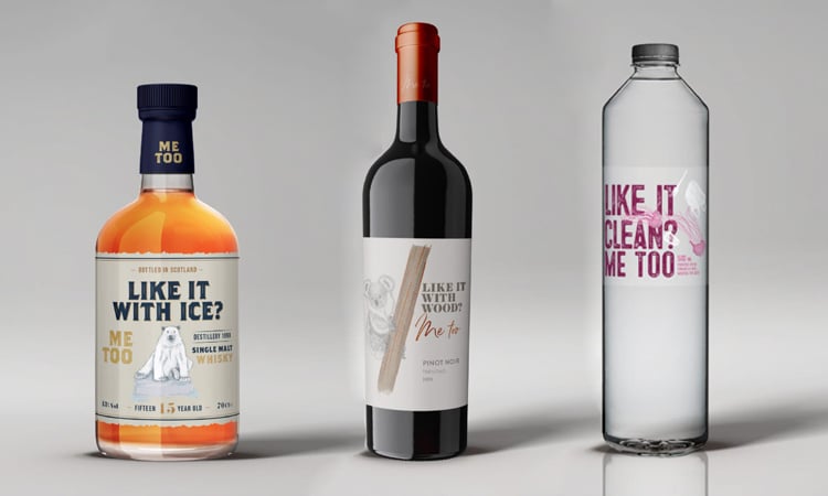
A label is also like a good wine, it needs some time to mature to show all the features of the product. The creative process is something that is trained, but it is also accompanied by work and inspiration. As in the case of "Me Too" the idea came to me like a spark and I immediately understood that I didn't have to look anymore, just start producing it. If you want ot take a look to this project check this link: https://blog.zooppa.com/2020/03/labelado-message-on-a-bottle-open-design-project-winners/
5. Describe the customer's requests. From the initial brief to the last word of the customer, what were their requests? And what were their goals instead?
I think this made this project so special, there was no Brief and the client didn't know the market. So the process was very collaborative from the choice of the type of wine to the final product. It was an absolute trust in my knowledge in the world of design and towards the export manager, we worked side by side in a relaxed and fun process.
6. Describe your feelings when you saw the finished project. Did the end product reflect your idea? Do the chosen finishings reflect what you imagined?
I remember it as a great achievement, because it was the result of a job that not only implied my point of view on a graphic level, but also the choice of many factors, including the wine itself. And every time we show this project it generates a positive impact. I think this wine label design manages to reflect that it was created, as something that shows all of us working on it.
Related post
Learn more
Mar 05, 2021
May 27, 2022
Feb 05, 2021