
Did you like the article? Share it!
The study of a design is a complex and delicate creative process, but preparing the executive file for print is even more so. Knowing how to properly examine a file from the point of view of the prepress can prove to be very useful to avoid running into unpleasant misunderstandings during the printing phase.
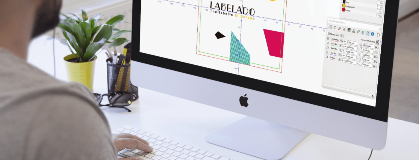
The moment of the "executives", or rather the preparation of the print files, is the one most feared by every graphic designer. In this phase, many questions arise and a little bit of anxiety is felt. Even if you are sure of the work done, the fear of having something wrong never leaves you and until you see the finished and printed work you never breathe a sigh of relief.
Even the best graphic designer can sin from a prepress point of view. It requires specific technical skills that go beyond the creative ones. Going to print and not getting the desired result is frustrating. But, it is even more so if this is due to an oversight in the print file, which could have been easily avoided and corrected.
To help you in this, we at Labelado have decided to reveal to you what are the most common errors we encounter in print files. Knowing them will allow you to verify the correctness of your digital file before sending it to us. Let's find out what they are together!
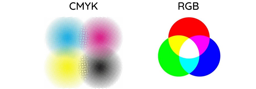
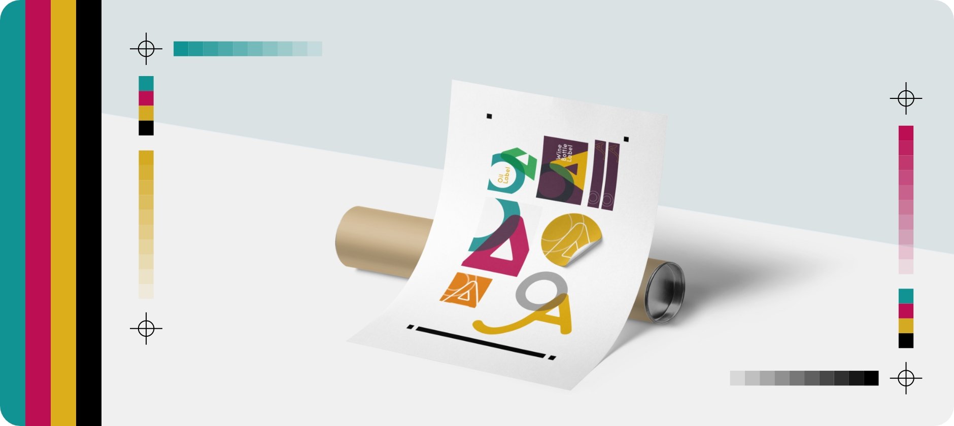
➤ Do not convert the file to CMYK
When creating the file you must take care to set the right colour method for printing, that is the CMYK method that allows you to manage four-colour and Pantone colours without entering colour profiles. Sending a print file with an RGB colour profile is perhaps the most common mistake made, one of those things to which little attention is paid, but which represents a terrible forgetfulness.
What you see on the monitor never matches what is printed. In fact, for the definition of colours, you cannot rely 100% on your screen. If you want to verify their performance, our advice is to request a printing proof, to have a true reference.
If you find that you haven't worked with the CMYK profile from the start, don't worry, you can convert to the correct colour profile at any time. The important thing is to remember to do it before sending the executive, to verify that all the colours correspond to those you have chosen in your graphics.
We can help you convert your file, if we receive files in RGB we will convert them automatically to go to print, but the colours can vary considerably if you switch from one colour method to another, so, to avoid surprises, it is better that you do it.
To learn more about CMYK colour mode,
read our article about it!
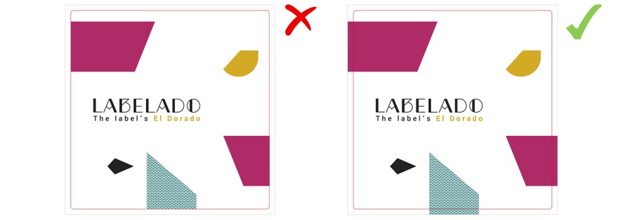
➤ Do not include the Bleed
Another beginner's mistake is not to enter the excess or the safety margin for cutting.
Although our cutting machines are extremely precise, there is a very small margin of error that can occur and which can lead to annoying consequences. If you don't add enough abundance, the punched final product will have a slight white border all around. This does not happen if you have a completely white background!
Inserting a safety margin consists in extending the colour, graphics or background image beyond the edges of the cutting die, on each side of the label. The minimum we require is approximately 2mm or 0.1 ". The bleed ensures that the entire background is printed and not cut off during production. For example, if you want to print a 50 x 50mm label, will background must be at least 54 x 54 mm (2.1 "x 2.1").
Find out more in our article on,
Mediabox, Trimbox, Bleedbox e Artbox!
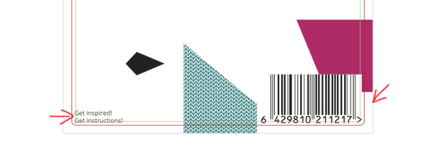
➤ Do not respect the safe zone
As mentioned earlier, a slight margin of error in the cut is possible. For this reason, important elements of the graphics, such as the texts must not be positioned too close to the edges, because in the cutting phase there may be slight deviations which would also cause the latter to be cut. For this not to occur it is important to respect the "safe area" of the printing and to consider at least 1 mm or 0.0625 "of margin on each side of the label. For example, if you want to print a 50 x 50 mm label ( 2 "x 2"), the safe area will be within 48 x 48 mm (1.875 "x 1.875") inside the die.
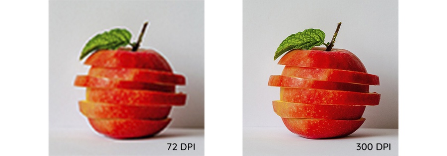
➤ Upload a low-resolution file
An optimal print file must be high resolution; what many do not know is that printing requires a minimum resolution, which is higher than that of a screen. Once printed, low-resolution images and graphics are blurred or pixelated.The typical resolution of 72 dpi digital is therefore too low to guarantee an optimal printing result. To ensure that the images are of good quality, the minimum recommended resolution for printing is 300 dpi. So when you embed an image in your file or work in Photoshop, make sure all images have at least 300 dpi resolution. If you work with black line images, however, they should have 1200 dpi resolution.
Another tip to maintain the quality of your images, the recommended formats are .tiff or .psd ( Photoshop). Also, always talking about images, if you work in Illustrator, all the images in your file should be embedded, so as not to run into any display errors.
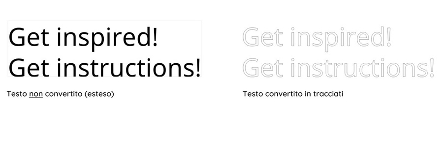
➤ Do not outline fonts or not embed them
The typographic element is a fundamental part of a graphic design. That said, it can often cause problems; the risk is that the text appears in a different font or changes in formatting when the file is opened from a computer other than the one that created it.
The best way to get around this error is to convert all text to paths. When the characters are converted into paths they are " blocked" because they become a real vector element of your graphic. By doing so you can be sure that they remain unchanged!
Another solution to this problem is to embed fonts in your executive; embed means that the font in the graphic is "integrated" into the file. This way you are making sure your draft looks the same for everyone, no matter what computer or software you use.
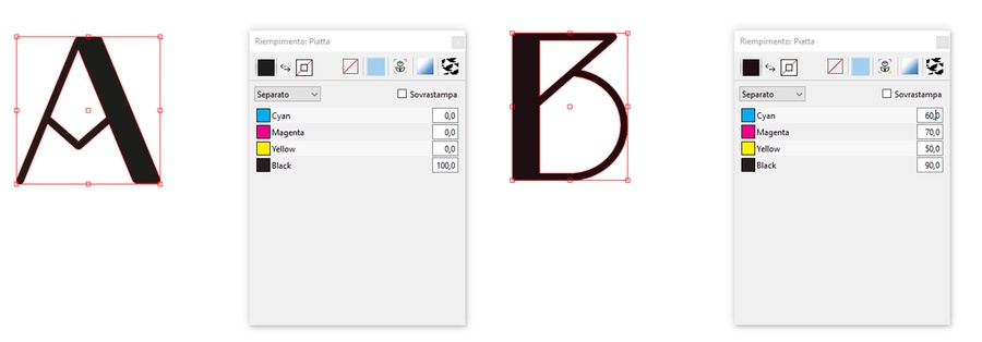
➤ Use the wrong Black ink
Now you may be wondering, "but why, are there more types of black?" Well, the answer is Yes. This is a very common mistake, that even the most experienced graphic designers run into. There are two types of black: pure black, the one obtained with 100% of K (i.e. the Black of CMYK), or the black obtained with a combination of all the components of CMYK (e.g. 60% of C / 70% of M / 50% of Y / 90% of K).
With pure black, more precise results are obtained, while the one in combination is used above all to achieve a more opaque and intense effect. The first is suitable for texts and all the other elements of a graphic, in the case of larger surfaces, such as a background, the second can be evaluated if it is necessary to obtain a fuller black. In any case, where possible it is always better to use pure black, to have cleaner results in print.
If we find texts or other elements in the file sent in black in combination, unless otherwise specified, these will be converted to 100% black, to facilitate printing.
➤ Upload a file of the wrong size
You define the dimensions of your printed product at the time of ordering. So make sure when sending the print file that you provide us with an executive that is paginated on the correct format and in doing so keep in mind the abatement rules.
➤ Do not upload a file in .pdf format
The best file format for sharing and printing is .pdf. It is a widespread and universal cross-platform format. This means it can be opened and saved from virtually any platform or software (Adobe Illustrator, Adobe Indesign, Adobe Photoshop, or any software capable of printing a file) making it very accessible.
To learn more about this file format,
see our article!
Extra Tips
+ Consider a level of opaque white (only for printing on transparent and metallized). If you choose to print on a transparent or metallic material, you will need to include a layer of White in your artwork file. The white level tells us which areas you want to be opaque or white and which areas you want to be transparent or metallic.
+ Dare and ask, we are here on purpose. Read the tips and guidelines for printing carefully, but also remember that you can call or write an email to clarify more complex technical issues. Trust me, it can help a lot and avoid any nasty surprises or hitches.
+ Try to print your executive. Make yourself a print test to see the effect of your file printed. By printing in actual size you can verify that the texts you entered are legible and not too small. The minimum font size we recommend is 4 pt. But be careful, the measurements may vary from font to font, so check that the lowercase “o” of your character is not less than 1mm, under that size reading is difficult.
We know, that to err is human; errors are on the agenda and careful preparation of drafts is essential to prevent them. Our advice is to make sure your file is ready to print and we hope these few tips can help you do that. And then don't worry if you miss something anyway, the Labledo team will take care of it personally.
Before proceeding with the drafts, our prepress operators check all the technical aspects relating to the file format, image resolution, colour profile and much more. Once this is done, the last word still awaits you; In fact, we will send you the proofs for approval and you will have to give your Ok to proceed with printing.
And in case you need more information on the preparation of your print file you can always contact us, we will be happy to resolve all your doubts. Good design!
Related post
Learn more
Aug 26, 2022
Jan 12, 2023