Did you like the article? Share it!
Pantone Colour of the Year announcement has become one of the most awaited moments by professional graphic designers and design lovers in general: the chosen shade establishes stylistic trends for the next year and represents the moment we are living. For this peculiar year, Pantone Colour of the Year is actually made up of two colours: Ultimate Grey and Illuminating, bringing a strong message of hope for the upcoming year.
Pantone is an American company born in the ‘60s and mainly focused on colour cataloguing and graphic technologies. Since 2000 Pantone Color Institute elects a particular color as “Color of the Year”: photographers, graphic designers, advertisers and artists gather to decide upon the reference color for the upcoming year, representing at the same time the current world. In 2017, for example, subsequent to many terroristic attacks and celebrities’ deaths like the ones of George Micheal and David Bowie, was chosen Greenery, a vital and reassuring color, symbol of arising life.
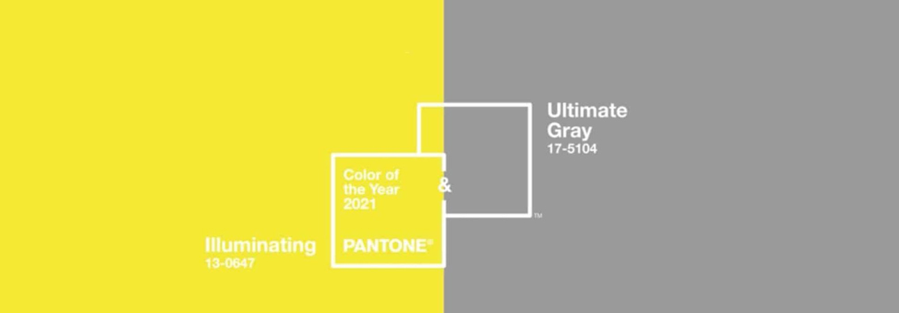
Illuminating and Ultimate Grey: 2021 colors
2020 has without a doubt been a particular year that made us face fears we thought passed. And Pantone’s Color of the Year could not ignore the recovery’s desire after a difficult year. Leatrice Eiseman, Pantone’s Executive director, described these two colours as concrete and firm, warm and optimistic, instilling a sense of resilience and hope to fulfill our essential need of encouragement.
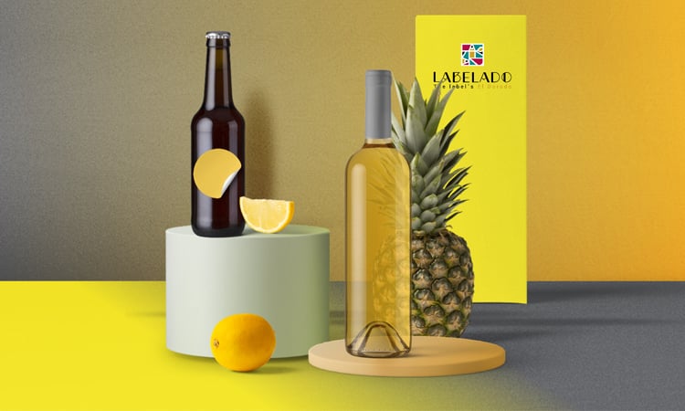
The chosen couple consists of Illuminating, a bright and cheerful yellow, an enveloping shade instilling energy and Ultimate Grey, a neutral and intense grey, communicating solidity and strength with a reference to natural elements such as rocks.
How to use Pantone Color of the Year in your designs
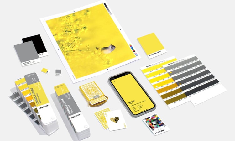
As highlighted by Pantone, yellow instills vitality and energy, while grey evokes reliability and experience. Those two colors can be used to create labels and graphic projects reflecting the latest trends: use them together, singularly or paired with other colors. For example, what do you think about Illuminating and Ultimate Grey on a white background with silver touches obtained with hot foil. Otherwise, you could apply a transparent paint on yellow to enhance even more its vitality… As you can see creative possibilities are for sure many, you just have to find the perfect match for your brand!
Would you like to test these Pantone colours on your labels and packaging? Send us your graphic design to request a sample print.
Related post
Learn more
Oct 14, 2020